Monday, February 24, 2014

Gophers Football Helmet - Concept

I made this up a while ago but figured I should re-post it. The University of Minnesota Gold Gophers should do a Nike pro-combat special design for one game next year......and look like a bunch of gophers running around. This is just a concept of the helmet....thoughts?!

Gopher Football Helmet - Nike Pro Combat
Follow us on Twitter - @UniForums


Wednesday, February 12, 2014

New Minnesota Timberwolves Uniforms - Concept

You'll see this original post over at www.whatwouldbuddo.com, but we wanted to post it here as well. We submitted a Timberwolves uniform concept to NBA.com's design contest. The details below explain each part of the uniform and how each professional Minnesota basketball team is represented in the design.

I spent the better part of the past few evenings coming up with a unique, yet classical mix of modern uniforms for the Minnesota Timberwolves. NBA.com had a contest in which you could submit concepts, so I used that as motivation. Motivation to create something that makes sense, not some kids idea of what looks "cute". 
You'll have to pay attention, as I did all I could to incorporate every professional Minnesota basketball franchise/team in to these uniforms. If I had better design tools, these would better...so please, look past that. 
Here's the home and away version in their entirety (below I have broken out the meaning of each design):

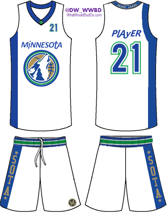
New Timberwolves Uniforms - Concept - HOME

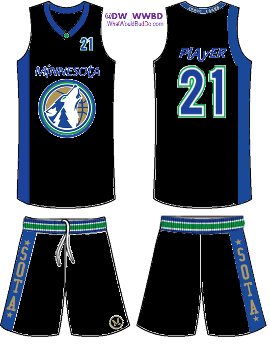
New Timberwolves Uniforms - Concept - AWAY
Here's a breakdown of each piece of the uniform.

Initiative: COMBINE EVERY MINNESOTA PROFESSIONAL TEAM TOGETHER - Timberwolves - Lakers - Pipers - Muskies

New Combo Logo: Using a similar idea I've seen in the past, a combo of the original log with today's secondary logo featuring the wolf looks pretty awesome. I featured an evergreen tree in the neck of the wolf (also featured on the collar of the 1996-2008 uniforms), added a new ring to the outside of the logo, and used a metallic gold color for the basketball. Similar to the gold used by the Muskies.


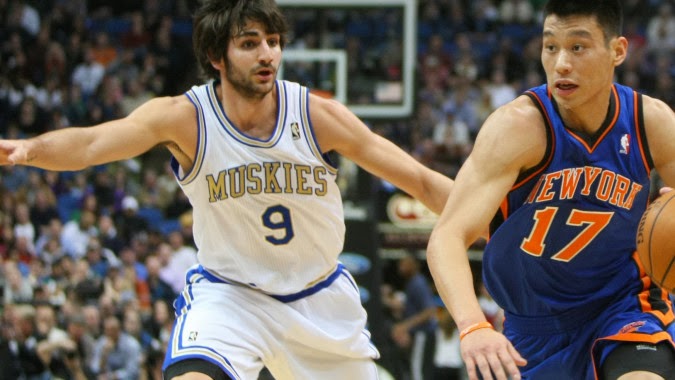
Minnesota Muskies Uniforms 
"Minnesota" On The Chest: Using a similar font to what the Pipers used, "Minnesota" on the front and the players name on the back are the same font. This font is super unique and very clean at the same time. It's really an awesome font...and had to be used. I took the liberty to carry that style to the players' names, and I think it'd be extremely unique.
Minnesota Pipers Logo
"10,000 LAKES" On The Collar: It appears the Minneapolis Lakers once rocked awesome warm up jackets that featured Minnesota's most unique tagline. I felt this had to be incorporated some where, and the back of the collar seemed right. It wouldn't be super accented but it'd be seen...sort of like the back of football helmets now. And we all know Minnesotans love their taglines specific to Minnesota.
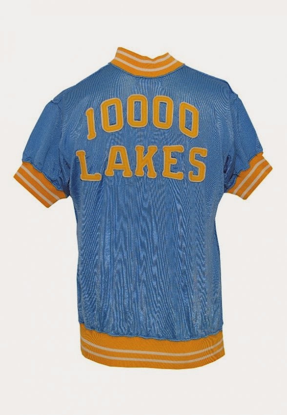
Minneapolis Lakers 10,000 Lakes Warm Up
*SOTA* On The Shorts: This idea stems from the popular *MPLS* logo that the Lakers once used. Rather than use MPLS, "SOTA" made more sense as the Timberwolves represent the whole state of Minnesota. It also adds an urban aspect to the uniforms that tend to feature past history, vs the current/future. The gold and blue are a combo of the Muskies' gold and Lakers' powder blue.
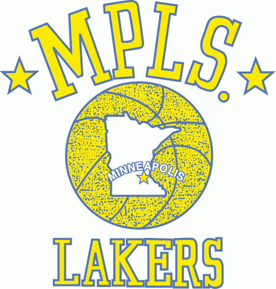
MPLS Lakers Logo
"M" On The Shorts: I couldn't quite confirm that this "M" was ever used by the Pipers, but it's too good to NOT use. It's similar to the vintage M the University of Minnesota used to use...so I added it anyway. It's simple and clean and adds a little flare to the front left side of the shorts.
Vintage M - Minnesota Pipers
Overall, these uniforms would be a definite upgrade for the Timberwolves, who possibly have the ugliest uniforms in the NBA. The stripe down the right side of the uniform is a traditional look that some teams are going back to, supposedly (Nets and Hornets being two examples). It's a slick, yet simple look...which fans like, so why not feature it?

We're interested to hear your thoughts, so please, comment on this post or interact with us on Twitter - @Uniforums - @DW_WWBD@WhatWouldBudDo


Uni-forums

Tuesday, February 11, 2014

We're Back!! .....With A Bang

We're back up! We took time to focus on a few things but have some uniform concepts to pump out for our local teams. We are affiliated with www.whatwouldbuddo.com and @DW_WWBD is our main content provider. Here are a few uniform related posts from WhatWouldBudDo.com while we've been away...

Stay tuned for a post on Thursday regarding uniforms we submitted in a contest. Super exciting...

You can find us on Twitter - @UniForums

Tuesday, April 9, 2013

Minnesota Vikings Uniform Leak?? Maybe...(or maybe not)

Jeff Anderson of the Minnesota Vikings tweeted a picture from Nike's official NFL Uniform event today. If you look close, are the NEW Vikings unfiroms peaking out from behind the corner?? Take a look

At first peak, it appears there are light colored helmets and pants!!!........but relax, thats the reflection of the Cardinals uniform next to the Lions uniform. I think.

What potentially sucks, is that there's a strip in a similar spot on the shoulder if this indeed the Vikings new uniforms. Again, this would suck...as that could indicate minor changes.

We already know there appears to be a darker purple and maybe metalic gold lettering...which if done right, could be super rad.

Keep up with Twitter today in case someone leaks something and share them with us on Twitter if you see something - @UniForums

That's all for now.

UPDATE: Anderson tweeted another photo of Adrian Peterson in front of the current Vikings uniforms...so no juice to squeeze it appears.


Minnesota Vikings - New Uniform Nuggets

By now, you are most likely aware that the Minnesota Vikings are one of the teams to officially announce they are changing uniform designs for the upcoming season. Graphic design artists have been hard at work mocking up designs for fans to look at and judge. I, however, don't feel like doing that...

What I will do, is throw out some ideas/thoughts that I'd like to see when they officially unveil the uniforms on April 25th.

- There is no way the Vikings go away from the color scheme of purple/gold/white. I expect they'll go back to the retro purple and I hope they go back to the retro gold. Will they add black or grey as a secondary color? Perhaps. Grey has busted on to the scene in a massive way with college uniforms, so if they do this...they must do it right. Black? No thank you.


- Helmet Finish: I'd like to see them go with a unique finish that Nike has yet to use with other uniforms. There have been a lot of chrome finish helmets being unveiled recently, and we all know about the matte finish helmets that dominated uniform changes in 2012-13...so what else can be done? How about a dull looking finish? Not matte, not chrome...but in between (and not sparkly). Think of it as drip pans for your stove, or tin foil but not quite so shiny. Keep it purple, keep the horns...I think it'd be sharp.

- Face mask color. This can make a WORLD of difference in my opinion. Think of how different the Vikings current throw backs look if they took the grey off and put on purple...it'd look stupid. I say KEEP the grey face masks, even if grey isn’t a secondary color.

- Speaking of secondary colors...grey should get consideration. Chad Greenway has already stated that the new uniforms make the purple "pop", but pay respects to the old school uniforms. If they choose to go with grey pants, I'd be fine with that. If they choose not to...I won't be shocked if the old grey face masks find their way back to the uniform design.

- Stripes: No...we don't want them unless they are simple and clean.

- Numbers: Unless Nike gives the Vikings a badass, trademarked font like they did with the Gopher Football uniforms, I say make them bold/traditional...clean. No fancy ones that look like a minor league baseball team is using the same font.

- Alternates: I hope, I mean REALLY hope, they unveil a third/alternate uniform like Seattle did. It'd be dumb not to...fans love that. My personal vote would be all black...but that would almost require black as a secondary color, and I don't want that. If they go with grey...they'll be copying the Seahawks. Yellow has always been mentioned...but it just doesn’t flow....on anyone.

From here, there isn't much else to share. I'm probably more excited about the uniforms than I am the draft, but the Vikings are my team...and uniform changes make people giddy. Lets hope the Vikings don't disappoint.

You can follow us on Twitter - @UniForums


Tuesday, March 5, 2013

Trim The Beaver

Hats off to Oregon State for updating their school's logo, along with their football uniforms. They made the logo smaller but tougher, which I like. It'll be fun to watch other teams within their athletics department update their uniforms designs.

You can read the story from Yahoo! here -
http://sports.yahoo.com/blogs/ncaaf-dr-saturday/oregon-state-gets-rebeaved-beavers-look-lot-different-045048032--ncaaf.html#more-26994
NEW Oregon State Football Uniforms - 2013 - (Facebook.com/OregonStateBeavers)
I've always had a soft spot for the Beavers (you can get funny with that if you'd like) due to Gary Payton, who was a childhood favorite of mine. The last time they updated their football uniforms, the likes of Steven Jackson, Chad Johnson and Derek Anderson were throwing up points all over the Pac-10 (sort of).

It seemed to give the school some spark.....and these new uniforms should do the same. They are flat out...awesome. Other programs should take notice if they have a uniform design that's getting stale.


You can find us on Twitter at
@UniForums


Sunday, January 27, 2013

Throwback Post: Chicago White Sox

Now THIS is what I'm talking about. The White Sox unveiled some sweet throwbacks this week. Other teams should do this as well. The Orioles, Blue Jays and Astros have done a throwback style look, but permanently. The White Sox should consider making this more of their every day look. 

White Sox Throwbacks For 2013


The ironic part? Navy blue and red were colors of the White Sox at one time.....that makes about as much sense as having black be the primary color for a team called the White Sox.

Nice work Chi-town...the fans thank you.


Follow us on Twitter - @UniForums