I spent the better part of the past few evenings coming up with a unique, yet classical mix of modern uniforms for the Minnesota Timberwolves. NBA.com had a contest in which you could submit concepts, so I used that as motivation. Motivation to create something that makes sense, not some kids idea of what looks "cute".
You'll have to pay attention, as I did all I could to incorporate every professional Minnesota basketball franchise/team in to these uniforms. If I had better design tools, these would better...so please, look past that.
Here's the home and away version in their entirety (below I have broken out the meaning of each design):
Here's the home and away version in their entirety (below I have broken out the meaning of each design):
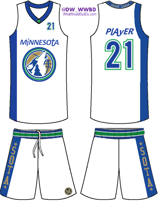 |
| New Timberwolves Uniforms - Concept - HOME |
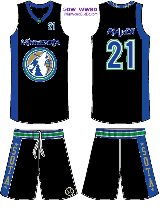 |
| New Timberwolves Uniforms - Concept - AWAY |
Here's a breakdown of each piece of the uniform.
Initiative: COMBINE EVERY MINNESOTA PROFESSIONAL TEAM TOGETHER - Timberwolves - Lakers - Pipers - Muskies
Initiative: COMBINE EVERY MINNESOTA PROFESSIONAL TEAM TOGETHER - Timberwolves - Lakers - Pipers - Muskies
New Combo Logo: Using a similar idea I've seen in the past, a combo of the original log with today's secondary logo featuring the wolf looks pretty awesome. I featured an evergreen tree in the neck of the wolf (also featured on the collar of the 1996-2008 uniforms), added a new ring to the outside of the logo, and used a metallic gold color for the basketball. Similar to the gold used by the Muskies.
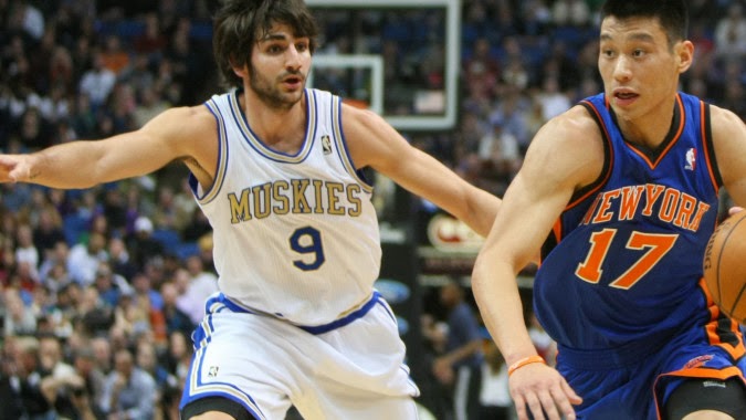 |
| Minnesota Muskies Uniforms |
 |
| Minnesota Pipers Logo |
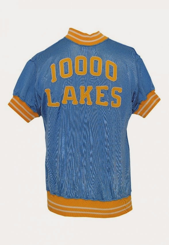 |
| Minneapolis Lakers 10,000 Lakes Warm Up |
*SOTA* On The Shorts: This idea stems from the popular *MPLS* logo that the Lakers once used. Rather than use MPLS, "SOTA" made more sense as the Timberwolves represent the whole state of Minnesota. It also adds an urban aspect to the uniforms that tend to feature past history, vs the current/future. The gold and blue are a combo of the Muskies' gold and Lakers' powder blue.
| MPLS Lakers Logo |
"M" On The Shorts: I couldn't quite confirm that this "M" was ever used by the Pipers, but it's too good to NOT use. It's similar to the vintage M the University of Minnesota used to use...so I added it anyway. It's simple and clean and adds a little flare to the front left side of the shorts.
 |
| Vintage M - Minnesota Pipers |
We're interested to hear your thoughts, so please, comment on this post or interact with us on Twitter - @Uniforums - @DW_WWBD - @WhatWouldBudDo
 |
| Uni-forums |
No comments:
Post a Comment