Showing posts with label NBA. Show all posts

Wednesday, February 12, 2014

New Minnesota Timberwolves Uniforms - Concept

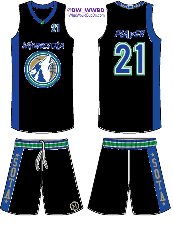
You'll see this original post over at www.whatwouldbuddo.com, but we wanted to post it here as well. We submitted a Timberwolves uniform concept to NBA.com's design contest. The details below explain each part of the uniform and how each professional Minnesota basketball team is represented in the design.

I spent the better part of the past few evenings coming up with a unique, yet classical mix of modern uniforms for the Minnesota Timberwolves. NBA.com had a contest in which you could submit concepts, so I used that as motivation. Motivation to create something that makes sense, not some kids idea of what looks "cute". 
You'll have to pay attention, as I did all I could to incorporate every professional Minnesota basketball franchise/team in to these uniforms. If I had better design tools, these would better...so please, look past that. 
Here's the home and away version in their entirety (below I have broken out the meaning of each design):
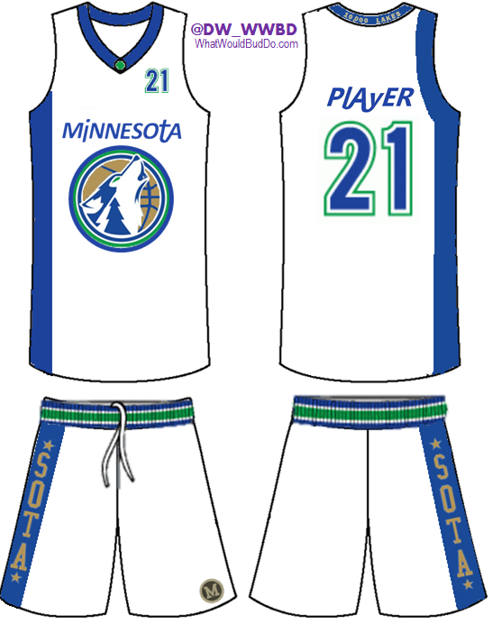
New Timberwolves Uniforms - Concept - HOME

New Timberwolves Uniforms - Concept - AWAY
Here's a breakdown of each piece of the uniform.

Initiative: COMBINE EVERY MINNESOTA PROFESSIONAL TEAM TOGETHER - Timberwolves - Lakers - Pipers - Muskies

New Combo Logo: Using a similar idea I've seen in the past, a combo of the original log with today's secondary logo featuring the wolf looks pretty awesome. I featured an evergreen tree in the neck of the wolf (also featured on the collar of the 1996-2008 uniforms), added a new ring to the outside of the logo, and used a metallic gold color for the basketball. Similar to the gold used by the Muskies.
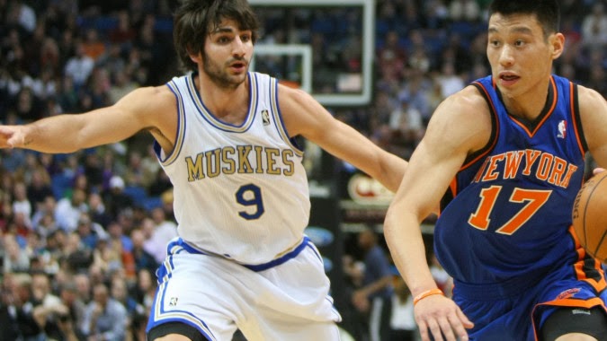


Minnesota Muskies Uniforms 
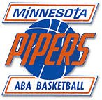
"Minnesota" On The Chest: Using a similar font to what the Pipers used, "Minnesota" on the front and the players name on the back are the same font. This font is super unique and very clean at the same time. It's really an awesome font...and had to be used. I took the liberty to carry that style to the players' names, and I think it'd be extremely unique.
Minnesota Pipers Logo
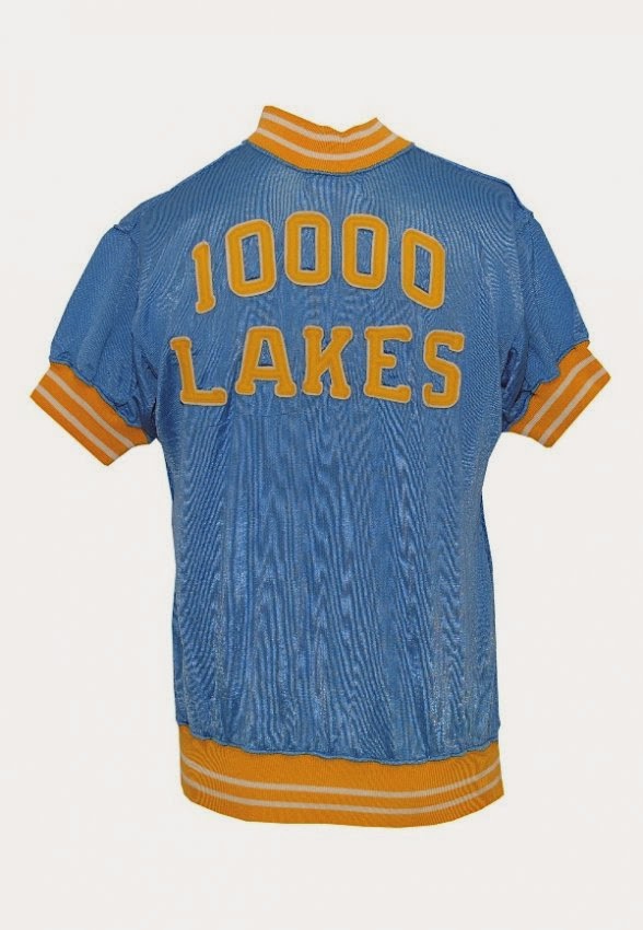
"10,000 LAKES" On The Collar: It appears the Minneapolis Lakers once rocked awesome warm up jackets that featured Minnesota's most unique tagline. I felt this had to be incorporated some where, and the back of the collar seemed right. It wouldn't be super accented but it'd be seen...sort of like the back of football helmets now. And we all know Minnesotans love their taglines specific to Minnesota.
Minneapolis Lakers 10,000 Lakes Warm Up
*SOTA* On The Shorts: This idea stems from the popular *MPLS* logo that the Lakers once used. Rather than use MPLS, "SOTA" made more sense as the Timberwolves represent the whole state of Minnesota. It also adds an urban aspect to the uniforms that tend to feature past history, vs the current/future. The gold and blue are a combo of the Muskies' gold and Lakers' powder blue.
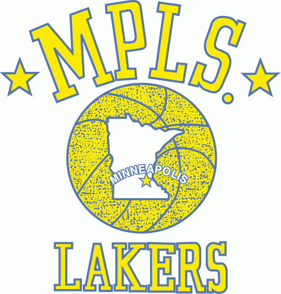
MPLS Lakers Logo
"M" On The Shorts: I couldn't quite confirm that this "M" was ever used by the Pipers, but it's too good to NOT use. It's similar to the vintage M the University of Minnesota used to use...so I added it anyway. It's simple and clean and adds a little flare to the front left side of the shorts.
Vintage M - Minnesota Pipers
Overall, these uniforms would be a definite upgrade for the Timberwolves, who possibly have the ugliest uniforms in the NBA. The stripe down the right side of the uniform is a traditional look that some teams are going back to, supposedly (Nets and Hornets being two examples). It's a slick, yet simple look...which fans like, so why not feature it?

We're interested to hear your thoughts, so please, comment on this post or interact with us on Twitter - @Uniforums - @DW_WWBD@WhatWouldBudDo


Uni-forums

Sunday, January 27, 2013

Typing Out Loud Vol. 1

winning design submitted by fans
A big reason for this blog is to have a place to put my mostly stupid thoughts on paper.......or a computer. I'll call it "Typing Out Loud" as that's exactly what I'll be doing. The grammar might suck, the flow of the thoughts may not be smooth, and I may not even make sense. Either way, some ideas may be worth discussion, who knows.

I'll start with today's news that the Milwaukee Brewers held a contest that let fans design a Spring Training uniform concept. GENIUS idea. I brought up a similar concept in a previous post for the NFL and Nike 
(read it here). It's a great way to express interest for fans that have creative ideas. 

Speaking of crazy uniform concept ideas, a colleague of mine and I were discussing a crazy cross promotion idea between the NFL and NBA. How crazy/rad/sad would it be if the NFL used the logos and color schemes of NBA teams for uniforms, while the NBA used NFL logos and color schemes for their uniforms?


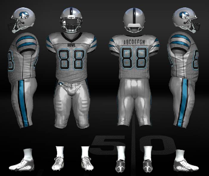
Let me clarify. NFL teams that have a NBA franchise in close proximity would accept designs from fans. These designs/concepts would be influenced by the NBA team's logo. Example: The Minnesota Vikings would wear Minnesota Timberwolves FOOTBALL uniforms, while the Timberwovles would wear Vikings themed BASKETBALL uniforms. Seems crazy right? Check this very poor visual (I threw this together in five minutes)


NFL uniforms influenced by NBA uniforms

NFL uniforms influenced by NBA uniforms
It seems like a stupid idea...and I get that. But it'd be super interesting to see what sort of designs fans would submit. I'll continue to work on digital designs for this as I don't have the tools yet to make good looking rough draft designs. If you have ideas you'd like to contribute, email UniForumsDW@gmail.com and I'll post them. The cross promotion could go between the NFL and MLB too...but baseball has a lot of traditional color schemes and logos. The audience for the NFL and NBA are already in place, it'd be a great idea in my opinion.

New Orleans Pelicans' Logo
In other uniform news, the New Orleans Pelicans (yes, that's a real NBA franchise name) release their official logo. My reaction: I oddly like it...which I think most people have a hard time admitting. It's unique to New Orleans as the Pelican is their state bird, and that's important. The "Hornets" just doesn't make sense. In the past few years, NBA teams have been going back to a more "retro" look for their primary logos (see the Wizards, 76ers, Cavaliers, Jazz, Warriors...). I find this odd because the NBA was the first professional sport to embrace the "cartooney" and "teal" concepts (see Vancouver Grizzlies and Charlotte Hornets). 

Some NBA teams will never change their logo due to their history, nor should they (see Celtics, Lakers, Bulls, Trailblazers), but some have flat out swung and missed with their uniform designs. Specifically, the Bobcats. If you're going to start a new franchise, you should at least let the fans vote on the best concept for uniforms and logos. Look at the Oklahoma City Thunder. No one outside of OKC was happy to see that franchise leave Seattle. Like New Orleans did with the Pelicans, Oklahoma City chose a nickname that's specific to them...the Thunder. "The Thunder? Seriously?" was everyone's thought. Well, it stuck. They didn't go crazy with their logo or their uniforms. They went with unique ideas and kept it simple...and that worked. Congrats to the Pelicans for taking the same approach. DEAR SEATTLE: Take note...

Lastly, I'm working on a post that will cover the rumors of four NFL teams making changes to their logos for 2013. Those four "rumored" teams are the Carolina Panthers, Minnesota Vikings, Miami Dolphins and Tampa Bay Buccaneers. You can ready the story about this rumor HERE.

As the author of this story suggests (and has apparently seen each logo change), one change is great, one is hardly noticeable  one is awful and one is modernized. It's possible that the Dolphins changes were leaked (to see it, click HERE), and if true, that would solve the "modernized" myth.

My prediction for the other three? 

Panthers - LOVE it
Vikings - Awful
Buccaneers - What changed?

The author suggests that Buccaneers fans don't need to worry about the Creamsicle uniforms coming back, so my guess is they don't change much...maybe just clean the logo up a bit. As for the other two teams, I'm from Minnesota...we just can't catch a break with any of our teams. That will result in the Vikings trying to make changes in house, through Nike, and completely botching a "re-branding" campaign. That won't sit well. 

I won't be surprised if the Panther come up with a cool new design. The "Carolina Blue" (not THE "Carolina Blue") was cool in the 90's when the franchise started. They haven't made many changes and their team has been garbage the past 10 years. They have a new regime in charge, and it only  makes sense that they'll go for a new identity. If they were smart, they'd change their colors and their logo. We should know before the NFL Draft in April...I guess time will tell.

That's all for now. Thanks for reading!

You can follow us on Twitter - @UniForums


Thursday, January 17, 2013

The NBA officially unveiled their 2013 All Star jerseys today. My initial response? "Um, what's different?". They look really similar to the past few All Star uniforms, but if you read the fine print of the press release, they do pay some respects to the history of Houston, which is cool I guess.

What happened to the crazy all star games that had more of an identity to the host city? The red/white/blue colors should be substituted for colors closer to the state/city that hosts the event. I'm not saying they need to be horrendous like the ones from when Phoenix hosted in 1995. Those were awful, but at least they were specific to the Arizona theme at the time. Phoenix did much better in 2009 using the red/white/blue specifics, even adding some gold to a pretty decent design.

The NBA has had some really bad All Star game uniforms since going back to the "traditional" red/white/blue concept (exhibit A, exhibit B), but what's worse? Ugly designs with host city specific color combos? Or ugly designs using the NBA’s red/white/blue color combo?


I'd like to see the NBA allow the host city work with Adidas to come up with All Star game uniforms with more identity. I get it, a more standard look will sell more jerseys...or so you'd think. But if you think about who's buying the jerseys, if your favorite player from your favorite team makes the All Star Game, those fans will buy that jersey regardless of the color combo, as long as it isn't horrendous. It works for Major League Baseball, and they don't even wear the custom jerseys during the game!

Hey, at least it's more creative than having the players wear their normal jerseys...(ie 2000 NBA All Star Game)


Follow us on Twitter - @UniForums